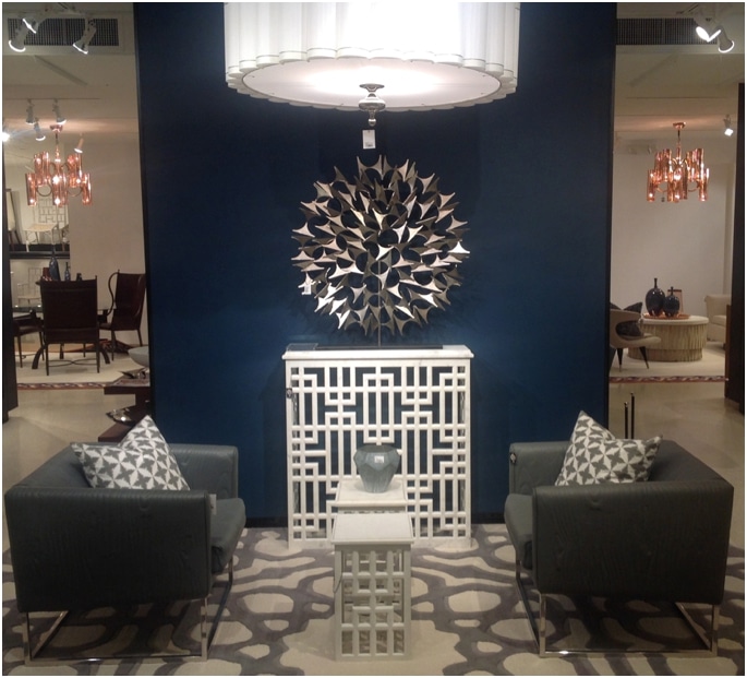
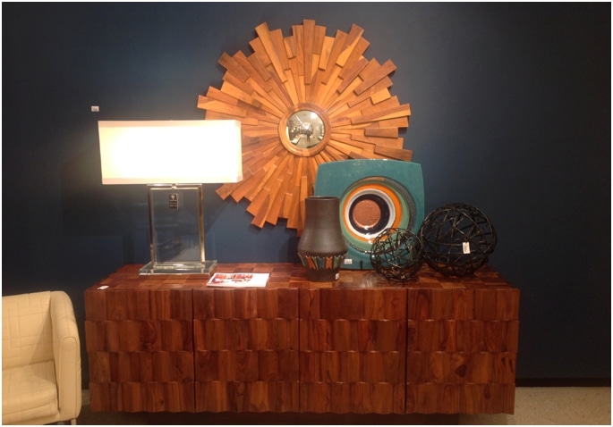
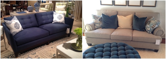
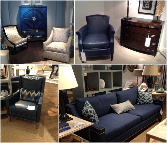
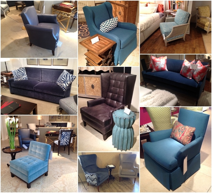
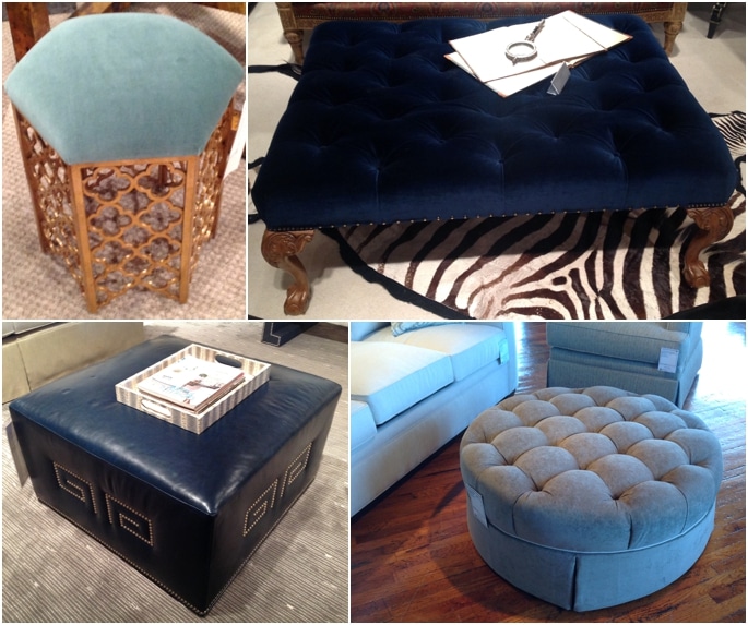
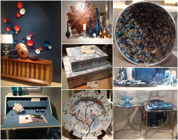
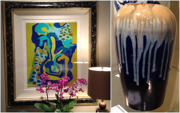
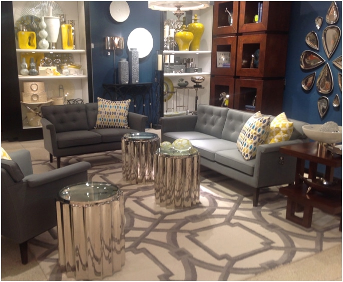
Blue is not a color we use often in our design practice, at least not for interiors. It features predominantly in some of our closets but it is not a color we gravitate too frequently as the basis of a color scheme.
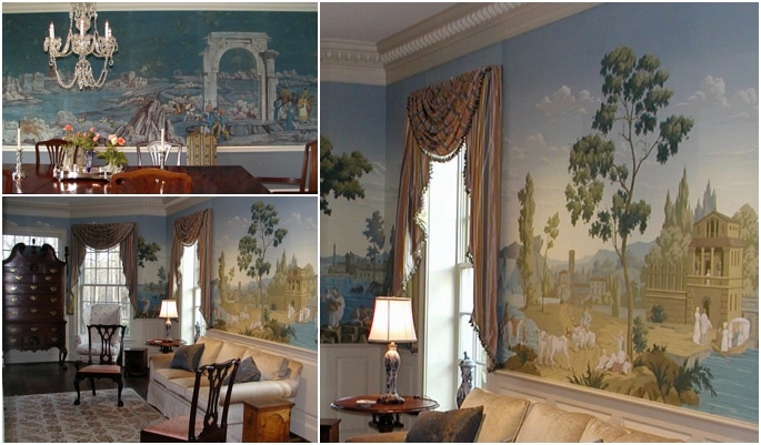
It is not that we have anything against blue, we love blue, but humans tend to feel more comfortable surrounded by warm colors as opposed to cool colors. So blue tends to be relegated to the part of an accent color rather than starring in the leading role. However a blue room is a classic and this hue is steeped in history and tradition and it is extremely versatile.
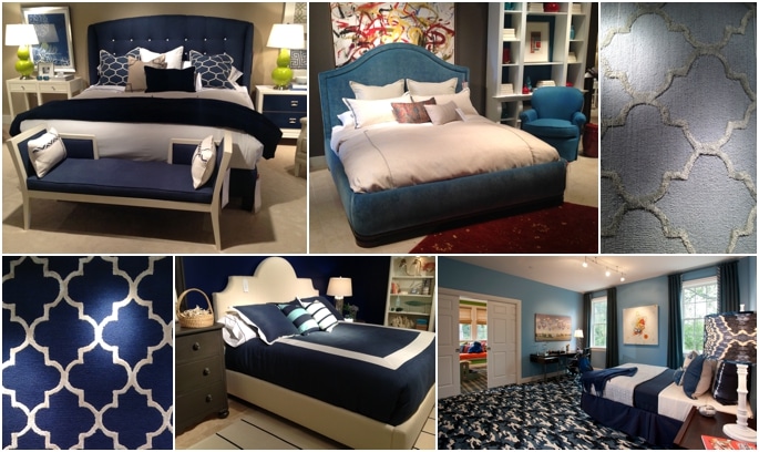
When you think of blue what shade comes to mind? Some think navy, others royal, or even a pastel. Blue is beautiful in every shade and tint and it works very well in interiors. One of our favorite pastel blues is Benjamin Moore’s Glass Slipper 1632 from the Classic Collection. We frequently use it far Master Bedrooms when we do use blue.
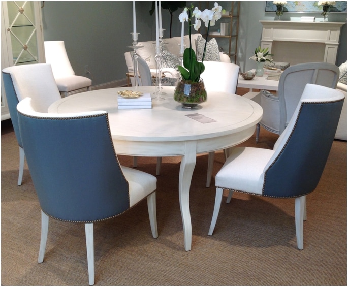
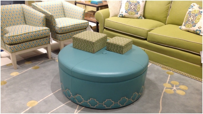
A highly versatile color, blue works with the most formal spaces and the most modern and contemporary spaces. Blue changes it’s personality based on what colors you pair with it. Add blue to green or purple and your scheme appears edgy, youthful and contemporary. Add blue to white, yellow or orange and your scheme appears classic, traditional or summery. The bottom line is blue is very versatile.
Blue is known to be calming and restful. Often used in healthcare it is soothing and offends no one. It also is known to satiate the appetite, so if you want to lose weight paint your kitchen blue, however we would not recommend blue in a restaurant as you may find the patrons order less food.
This very regal color has withstood the test of time and is now trending and becoming popular again. Look for more blue rooms in our portfolio as we are currently using it in several projects. So are you feeling it? Blue?
