It’s that time of year again: Pantone has finally released its 2020 color of the year. Every year, major paint and color companies announce their Color of the Year; these colors set the stage for a variety of trends in all facets of design. This past year, we saw Pantone’s Living Coral, Sherwin-Williams’ Cavern Clay, Benjamin Moore’s Metropolitan, and Behr’s Blueprint. Let’s take a look at next year’s picks!
Pantone: Classic Blue 19-4052
For 2020, Pantone has gone from the vibrant Living Coral to the vivid Classic Blue.
Leatrice Eiseman, the executive director of the Pantone Color Institute, offers some insight: “We are living in a time that requires trust and faith. It is this kind of constancy and confidence that is expressed by PANTONE 19-4052 Classic Blue, a solid and dependable blue hue we can always rely on. Imbued with a deep resonance, Classic Blue provides an anchoring foundation. The boundless blue evocative of the vast and infinite evening sky, Classic Blue encourages us to look beyond the obvious to expand our thinking; challenging us to think more deeply, increase our perspective and open the flow of communication.”
Sherwin-Williams: Naval Hue SW 6244

Sherwin-Williams also hopes to instill peace and calm for everyone. According to their director of color marketing, Sue Wadden, “The use of color in interior design is changing. It’s not just about what a space looks like anymore, but how it makes you feel.”
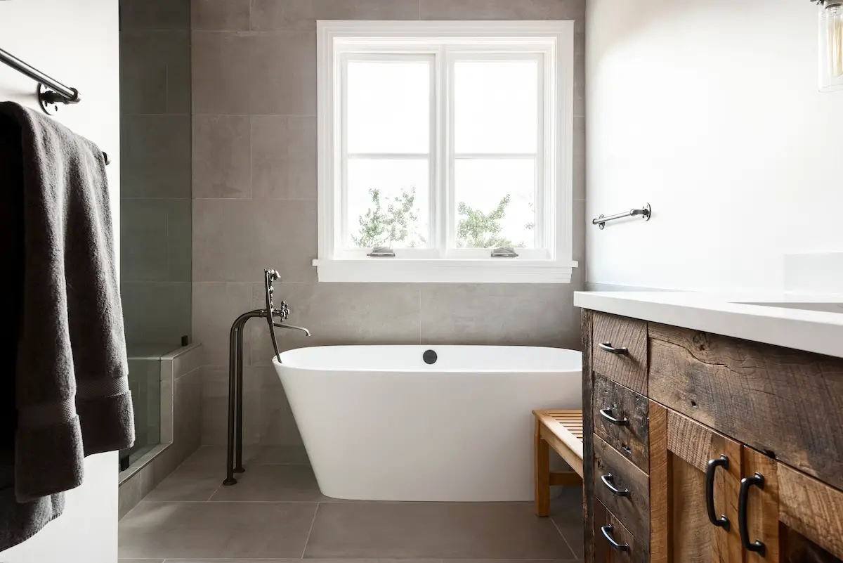
They hope that naval hue will instill both calm and confidence. It’s also designed to match a variety of textures and luxurious finishes, such as marble and metallics.
Benjamin Moore: First Light 2102-70

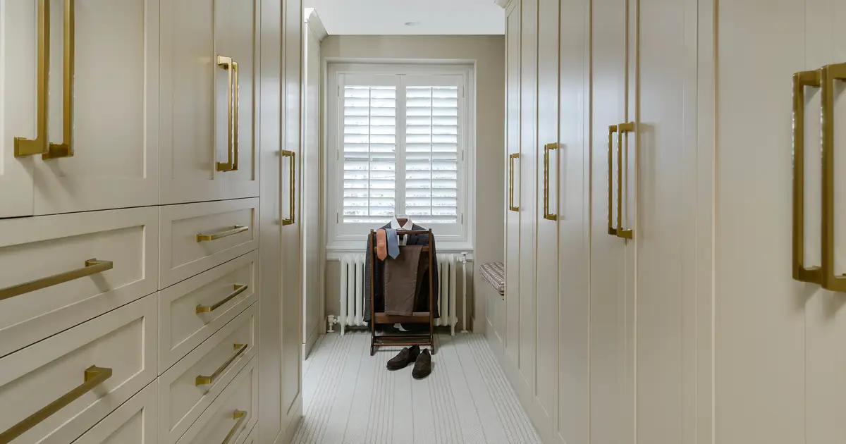
Benjamin Moore chose a light, rosy-colored hue for 2020 with First Light. Like their 2019 pick, Metropolitan, it works well as both a stand-alone color and as a neutral.
According to Andrea Magno, Benjamin Moore Director of Color Marketing and Development, “We selected First Light 2102-70 as our Color of the Year 2020 to represent a new dawn of idealism, design and living…First Light 2102-70 reflects a new definition of the home – a shift in mindset from the material to satisfying the core needs in life: community, comfort, security, self-expression, authenticity and ultimately, optimism.”
Behr: Back to Nature S340-4

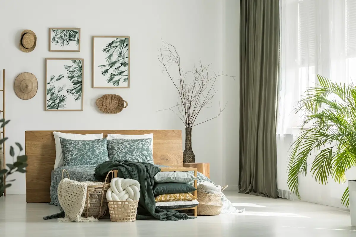
Behr has shifted to a meadow-inspired green this year with Back to Nature. Their VP of Color and Creative Services, Erica Woelfel, says, “As we look ahead to a new decade, Back To Nature encourages us to re-engage with the natural world, which we know can have a real, positive impact on our well-being…Everyone has a different way of engaging with nature. Whether you’re biking on a forest path, canoeing on a lake or walking on the beach, green is prevalent in nearly every outdoor landscape—it is easily nature’s favorite color.”


