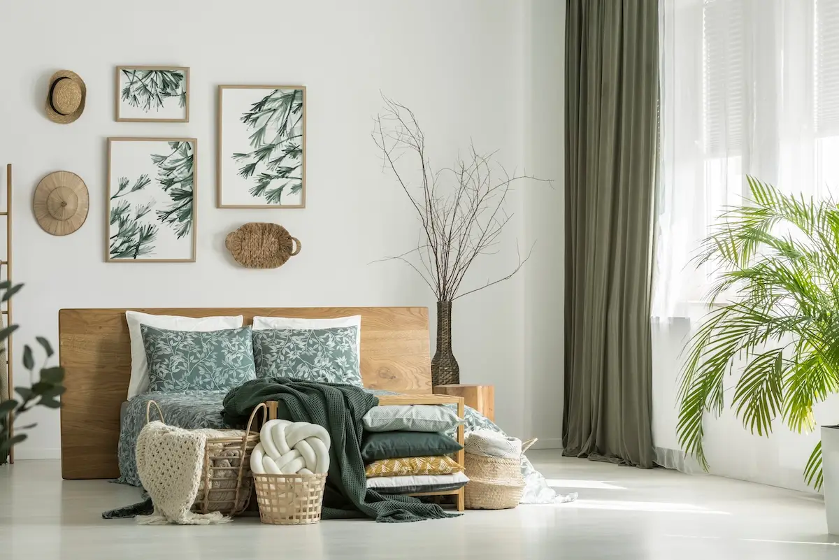
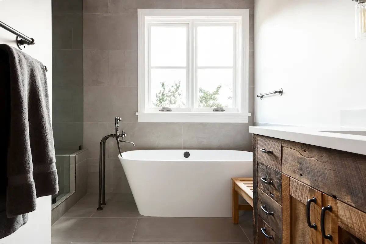
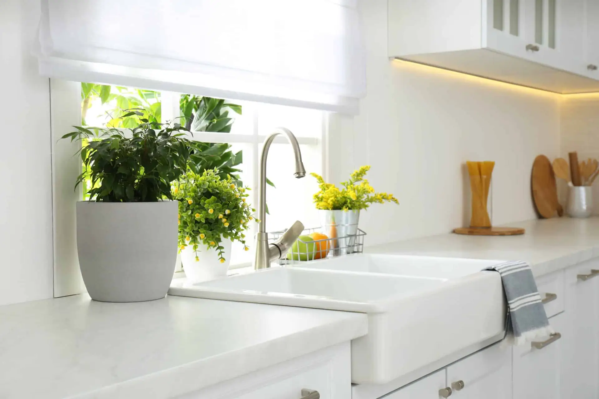
Color trends have exploded in the past few years and vibrant pops of color continue to make their way into homes. Even though you can still find a variety of white paints for a timeless look, white is considered a “safe” color. There’s nothing wrong with that, but if you’re looking to add more personality into your home, color is the best way to do so without taking up any physical space. In fact, you can even create the illusion of more or less space depending on the colors you choose and where you use them.
WPL Interior Design loves Benjamin Moore interior paint colors. Quality-wise, they are one of the best paint companies in the industry, and they also offer the best selection of colors. Whatever color you decide will be based on a variety of factors such as the architectural style of your home and what the rest of your decor looks like. Another consideration is what you’ll be painting; a wall, woodwork, furniture, cabinets, or something else? Here are some of our favorite interior paint colors that we’ve used for different projects.
Our Most Popular Interior Paint Colors

Philadelphia Cream: How could we not love this color named after our city? This is a soft yellow that is part of Benjamin Moore’s Historic Color collection. Even though it is inspired by Philadelphia’s historic landmarks, it still works well in both traditional and contemporary spaces.

Hawthorne Yellow: This yellow is cheery and bright, perfect for breakfast rooms and morning rooms. It really wakes you up and gets you ready to start your day!

Salsa Dancing: A rusty orange that has deep, warm tones. It has just the right amount of bold yet still can be matched with other colors from Benjamin Moore’s Affinity Color collection.

Tudor Cream: A soft blush color that compliments and illuminates almost any other color.

Classic Burgundy: This is our favorite red from Benjamin Moore. It’s one of the hardest colors to produce and usually takes an extra coat or two to show off the true color.

Heritage Red: Benjamin Moore’s brightest red; it will remind you of a fire engine or a Ferrari. This bright hot red is frequently seen on the front doors of historic homes in Philadelphia’s Society Hill.

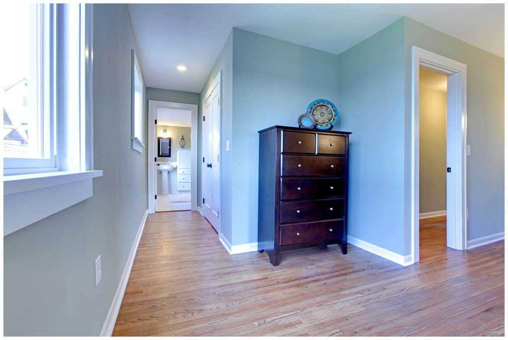
Palladian Blue: Although this is called blue, it is really more of a soft green. We love this interior paint for when you just want a hint of color and nothing too overwhelming.

Hancock Green: This pale green with yellow undertones is another color part of Benjamin Moore’s historical palette. However, we still love using this in fresh and contemporary spaces for a timeless look.

Glass Slipper: One of our favorites, this pale blue is almost cloud-like. It’s restful, calming, and very easy on the eyes.

Van Deusen Blue: A saturated blue with gray undertones that looks great in high-gloss on front doors.

Tudor Brown: This is a wonderful dark brown that is inspired from England’s Tudor homes. We like to use this color for woodwork and ceiling beams.

Charleston Brown: This is a slightly lighter brown that also works well for woodwork and ceiling beams.
Call Upon the Color Experts
Now that we’ve shared some of our favorite Benjamin Moore interior paint colors, what are some of yours? As we’ve mentioned before, choosing the right color for your home involves a few different considerations. Our designers and WPL Interior Design are here to help guide you through the process of refreshing your home, whether it’s choosing new colors or matching existing ones. To schedule a paint color consultation for your next home project, give us a call today at 215-592-9570.
